
Custom CSS Blog Style on hashnode
Edit the custom css styles of hashnode to make my blog look like a real notepad

Today I would like to take you with me through the journey of styling my hashnode blog with the new custom css feature.
The goal
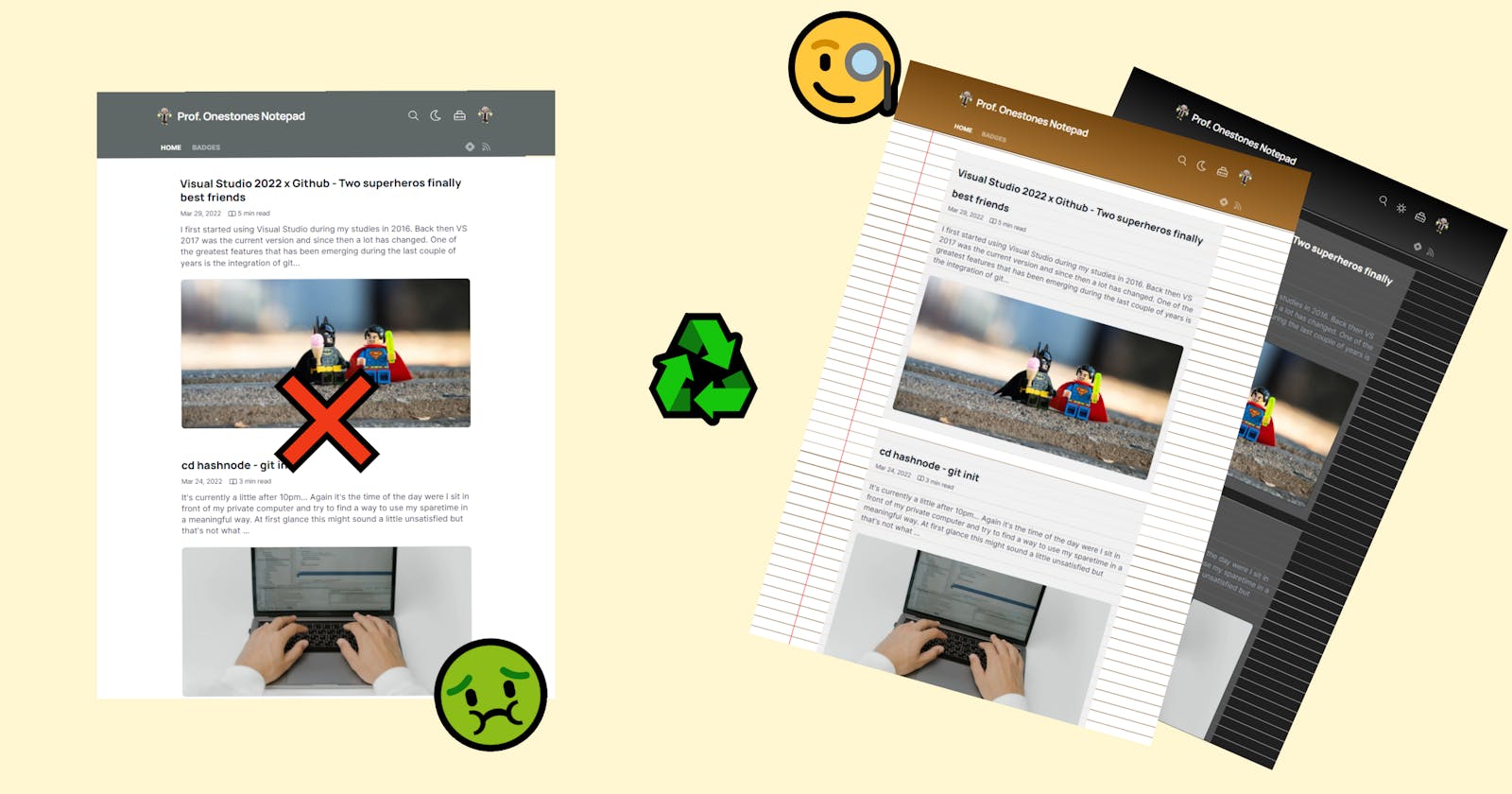
As I named my blog ProfOnestone's Notepad, I want it to actually look like a notepad in some way. My first thought was to go with the typical legal pad style but I simply don't like the color yellow very much... 🤢
So I'll go with a more whiter appearance.
The main elements I need for a notepad styled blog are:
- a header
- lined paper
- a stylisch vertical line
and that's basically all.
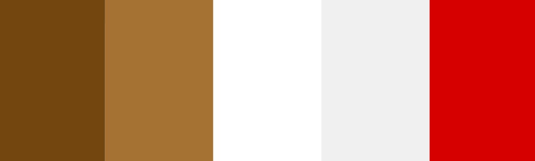
1. The color-palette
To get an idea of the colors to use I headed over to Adobe Color Explorer and search for legal pad. This tool just lists you a matching pictures with an extracted color-palette. So awesome! 👨🎨
I adjusted a palette to my liking and got rid of the yellow. Finally I created some css variables to hold the colors of the palette.
:root{
    --HeaderTop:#734610;
    --HeaderBottom:#A67233;
    --Background:#FFFFFF;
    --Lines:#734610;
    --VerticalLine:#D70000;
    --Card:rgb(240,240,240,0.9);
}
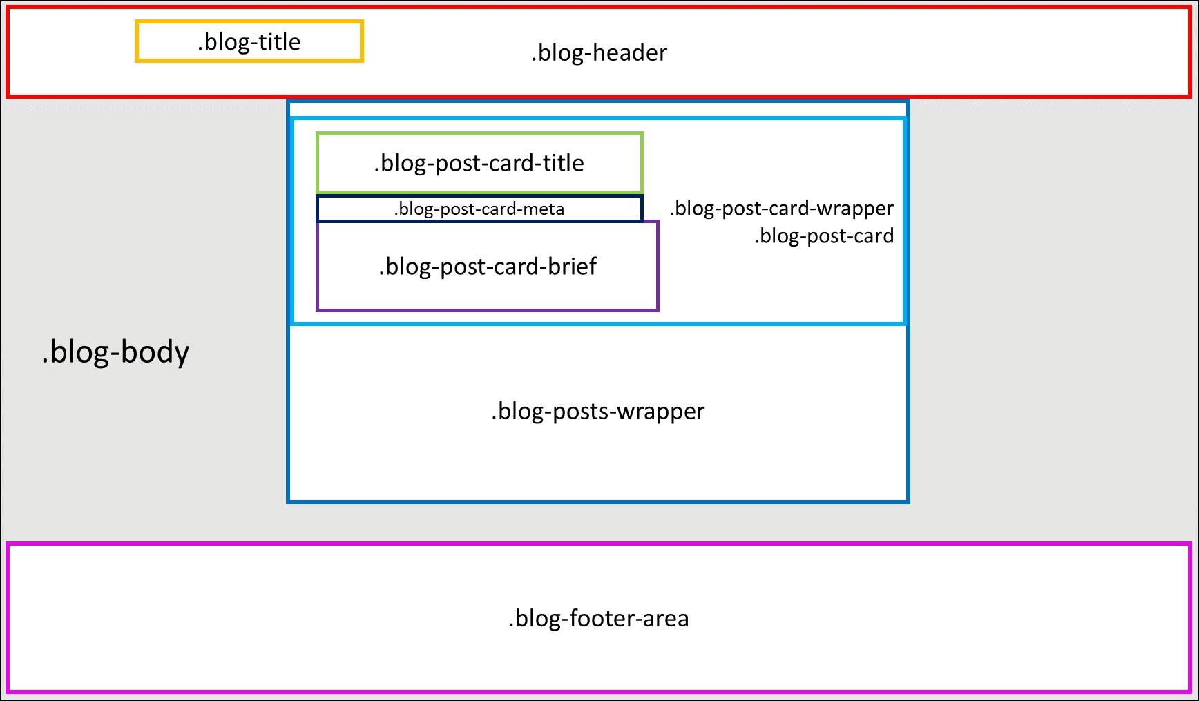
2. Analyze the existing classes of the blog
To start adjusting the existing classes on my blog I went into the developer tab of chrome and started to analyze the elements.🔍👀 To save you some time here are the main classes of the home-page that you probably want to adjust:
// main elements
.dark{}
.blog-body{}

//header
.blog-header{}
.blog-title{}

//post-section
.blog-posts-wrapper{}

//post-cards
.blog-post-card-wrapper{}
.blog-post-card{}
.blog-post-card-title{}
.blog-post-card-meta{}
.blog-post-card-brief{}

//footer
.blog-footer-area{}
And here you can see how they are layed out on the page:
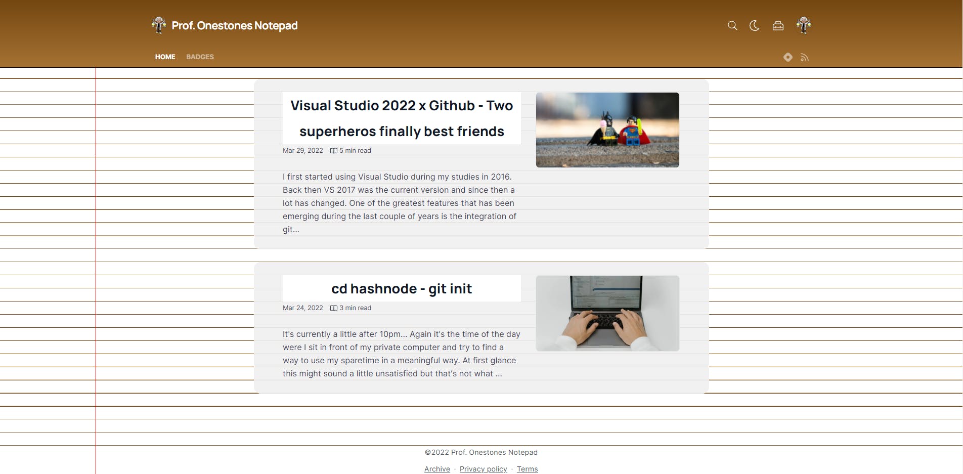
3. Styling the lined paper-background
For a lined style I had to apply a repeating-linear-gradient as the background-image, alternating between my background-color and my lines-color. I found the typical font-size of the existing text on the blog to be 1.125rem so I decided to come up with a line height bigger than that and settled with 1.8rem.
And here ist the result:
4. Aligning the text with the lines on the paper
To keep all of the text in sync with those lines, the '''line-heights''' need to match. 📏 For one single div it's quite easy to achieve this behaviour, but with individual paddings and margins on all the different elements the sync between text and lines can easily get messed up.
Looking at the following example you can see that the first two text-elements are perfectly in sync with the background. But the third one is kind of off...
If you look into the css code you can see that the second div has a margin-bottom:2.8rem. As this is not a multiple of the choosen line-height of 1.8rem the following content doesn't match the background lines.
So to prevent this on the blog I needed to make sure that any margin, padding or line-height is a multiple of 1.8rem.
Therefore I added some additional variables to the root so I can easily apply them on other elements.
    --HalfHeight: 0.9rem;
    --CommonHeight: 1.8rem;
    --DoubleHeight: 3.6rem;
    --QuadHeight:7.2rem;
There were quite some positions where I needed to fix those kind of issues. But I finally got it to work the way I intended it to be but.... with this kind of layout the posts were really hard to distinguish from each other. To handle this I decided to give the individual card a background with adjusted opacity. This way you're able to see that the text is fitting the lines of the paper but the posts are also clearly separated from each other. For are better user-experience I also added a typical hover effect on each of the cards.
5. Adding the vertical line
A iconic feature of notepads is the vertical line which divides a small part of the page from the rest. In real-life you mostly use it for side-notes or to add a date on any writing on your blog. In my case I just want it to make the notepad to look a little more interesting.
To achieve this I used the following lines of css.
@media (min-width: 820px){
.blog-body:after{
    content:"";
    position: absolute;
    top:0;
    left:0;
    width:10%;
    height:100%;
    border-right:2px solid var(--VerticalLine)!important;
    display:block!important;
    }
}
It's just a simple element after the blog-body with some border styling. But as the content expands to full width on smaller screens 📱, I had to disable it with an additional media-query.
6. Toggle dark-mode 🌚
Today everybody want's a dark mode of everything. Your smartphone, your browser, GitHub, your IDE almost any software tool out there provides a dark mode these days. So it seems like I need to design a dark styled notepad, too.
Thankfully hashnode already provides you with the dark class. So all I needed to do was to extend this class. Therefore I'm just overwriting my predefined color variables with a darker palette.
So this was all I needed to do:
.dark{
    --HeaderTop:#030303;
    --HeaderBottom:#363636;
    --Background:#202020;
    --Lines:#D9D9D9;
    --Card:rgb(89,89,89,0.9);
    --VerticalLine:yellowGreen;
}
7. The result
There it is a blog styled like a real notepad. You can have a look at the full css on my GitHub .
Further steps
With the home-css all set up I will now move on to the articles-css and pages-css to match the notepad style.
What do you think? Do you prefer the light or the dark version? Let me know in the comments down below. 📝
Thanks for reading!
Sincerely,
ProfOnestone